livewall
← All articles
Employee Experience14 May 2026·Livewall

Career page design: what job seekers are actually looking for before they apply

Job seekers don't read career pages like brochures. They scan for signals. Here's what they're looking for and how to design those signals clearly.

employer-brandinghr-tech

A career page doesn't need to persuade. It needs to confirm.

Most people who land on your careers site are already somewhat interested. They searched your brand name, clicked from LinkedIn, or heard about you from someone they trust. They're not looking to be sold. They're looking for evidence that their instinct is right.

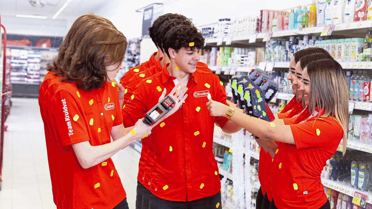
At Livewall, we design and build working-at websites for brands in retail, entertainment, and professional services. What we see consistently: the pages that convert best are not the most visually impressive or the most comprehensive. They're the pages that answer quickly, honestly, and concretely the questions the candidate already has in their head.

Those questions are always the same. Does this culture match who I am? Are the people here like me? What will I actually do every day? Where could I be in three years?

You have a few seconds to answer them. After that, they're gone.

Livewall perspective

Candidates don't read career pages linearly. They scan until they find something that fits, or until they leave.

What job seekers are actually scanning for

Eye-tracking research and our own work show the same pattern consistently. Job seekers scan for four categories of signals.

People signals. Photos and video of real employees, not stock imagery. Quotes with names and job titles attached. Faces that look like the target candidate.

Culture proof. Concrete statements about what it's genuinely like to work there. Not 'we work hard and celebrate success together', but: 'Every Friday at 4pm we close the week with a team retro, even when the project didn't go well.'

Growth signals. Career paths, learning tracks, routes upward. Not bullet points, but real stories from people who progressed internally.

Threshold information. What are the actual requirements? What are not? What does the application process look like? How long does it take? When will they hear back?

If any one of these four categories is missing or unclear, a significant portion of your visitors will leave. Not because they're uninterested, but because the uncertainty becomes too large.

The most common mistake: too much brand, not enough candidate

Most careers pages are written from the company's perspective. 'We are a market leader.' 'We stand for innovation.' 'We offer a dynamic working environment.'

A candidate reads that and thinks: fine, but what does that mean for me?

The most effective employer branding writes from the candidate's point of view. Not 'we offer', but 'you'll have'. Not 'our culture', but 'here's your day'. Not 'growth opportunities', but 'Fatima joined as a store assistant and is now team lead for seven people.'

This also takes courage. Specific stories are less generic and therefore feel less safe to publish. But they are far more persuasive.

With the Kruidvat Vriendenteam campaign, we made the application process itself a social moment: friends could apply together. That's not a description of culture. It is culture in action. Candidates understood what Kruidvat was like from a single glance.

Kruidvat Vriendenteam campaign: applying with friends

The Kruidvat Vriendenteam campaign turned the application process itself into a culture signal.

6 secaverage time before a job seeker decides to stay or leave a career page
72%of candidates actively look for employee stories before applying
3xhigher conversion on career pages featuring real employee video versus stock imagery

Design for scanning behaviour, not for reading

Most career pages are structured like a brochure. Intro text, mission and values, open positions, contact form. Neat, but out of sync with how people actually behave.

Candidates jump around. They look at the photos first, then the headings, then the pull quotes. They scroll down, click an opening, read the first half and go back. They have two tabs open at once.

Good career page design accounts for that.

  • Put the most convincing signal near the top, not buried in the fifth paragraph
  • Use visual hierarchy to guide the scanning pattern
  • Make each section legible on its own, for visitors who enter mid-scroll
  • Make the path to applying accessible at multiple points, not just at the bottom

This is also where UX/UI design and employer branding connect. It's not just what you say. It's how the page behaves.

The role of preboarding

A career page doesn't end at the apply button. The period between offer acceptance and start date is a critical moment for retention. Someone who hears nothing in that window, or only receives a standard welcome email, starts to doubt their decision.

The best employer brands extend the experience. They send relevant content, introduce future colleagues, give a preview of the first week. It sounds obvious, but most companies don't do it.

Pre-boarding tools are a direct investment in early retention. Across work for Trekpleister, Kruidvat, and Partou, we've seen that new hires who go through a strong preboarding experience reach productivity faster and drop out before day one significantly less often.

That journey starts on the career page. But it doesn't end there.

Livewall perspective

A career page that only describes what the company offers misses half the conversation. Candidates want to know what it means for them.

What strong career page design actually does

The career pages that convert best share a few things.

They show real people. Not just in photos, but in stories with names, titles, and specific experiences.

They are honest about what the job is actually like. Not every role is for everyone. Good pages help candidates self-select, which also saves the recruitment team time.

They are fast to scan. Clear headings, short paragraphs, strong visual hierarchy. Not a novel.

They make the next step easy. Not a single contact form at the bottom, but multiple accessible entry points throughout.

At Livewall, we work on recruitment campaigns and working-at websites for brands that understand attracting talent starts with an honest, clear, and compelling digital starting point. The career page is that starting point.

Livewall

Want a career page that actually converts?

At Livewall, we design and build working-at websites that tell the right story to the right candidate at the right moment. From strategy and UX to technical build and content.

Get in touch with our team

What we do

Livewall builds brand experiences that people actually remember — interactive campaigns, loyalty platforms, digital products, and employer branding for ambitious brands.

Our work

We've worked with HEMA, Stabilo, Wehkamp, Efteling, 9292 and many others. Every project starts with the same question: what would make someone actually want to do this?

Talk to us

Working on something similar? We'd love to hear about it.

Contact Livewall →